
Strategy execution is about choosing actions that improve performance
Strategy execution is not simply about allocating resources to get actions and projects done. Strategy execution is about closing the performance gaps between where the organization is today and where we want to be in the future. To close these gaps, leaders must make decisions about where, when and how to invest their limited resources. Though this may sound simple, decision-making is complicated by the fact that leaders are human, and human beings are inconsistent by nature.
“Whenever human beings make judgements, they are noisy. It’s a source of error as well as injustice. Wherever there is judgment, there is noise – and more of it than you think. “
Dr. Kahneman, Noise: A Flaw in Human Judgement
How do leaders know if actions taken within their organizations are having an impact?
To prove and to improve an organization’s performance, we must first measure the impact we want to achieve (performance results); otherwise, we are just guessing.
“There are many ways to reduce noise (in our decision making), but first you need to measure it”
Dr. Kahneman, Noise: A Flaw in Human Judgement
What’s creating the noise (and thus the error) in our strategy execution decisions?
There are many sources of noise, and here are two of the most significant that need leaders’ attention:
- How leaders interpret signals from their measures’ data
- What leaders pay attention to when allocating resources.
“Data are generally collected as a basis for taking action. However, unless potential signals are separated from probable noise, the actions taken may be totally inconsistent with the data.”
Donald Wheeler, Understanding Variation, the Key to Managing Chaos
Leaders, stop reacting to noise within your data visualizations
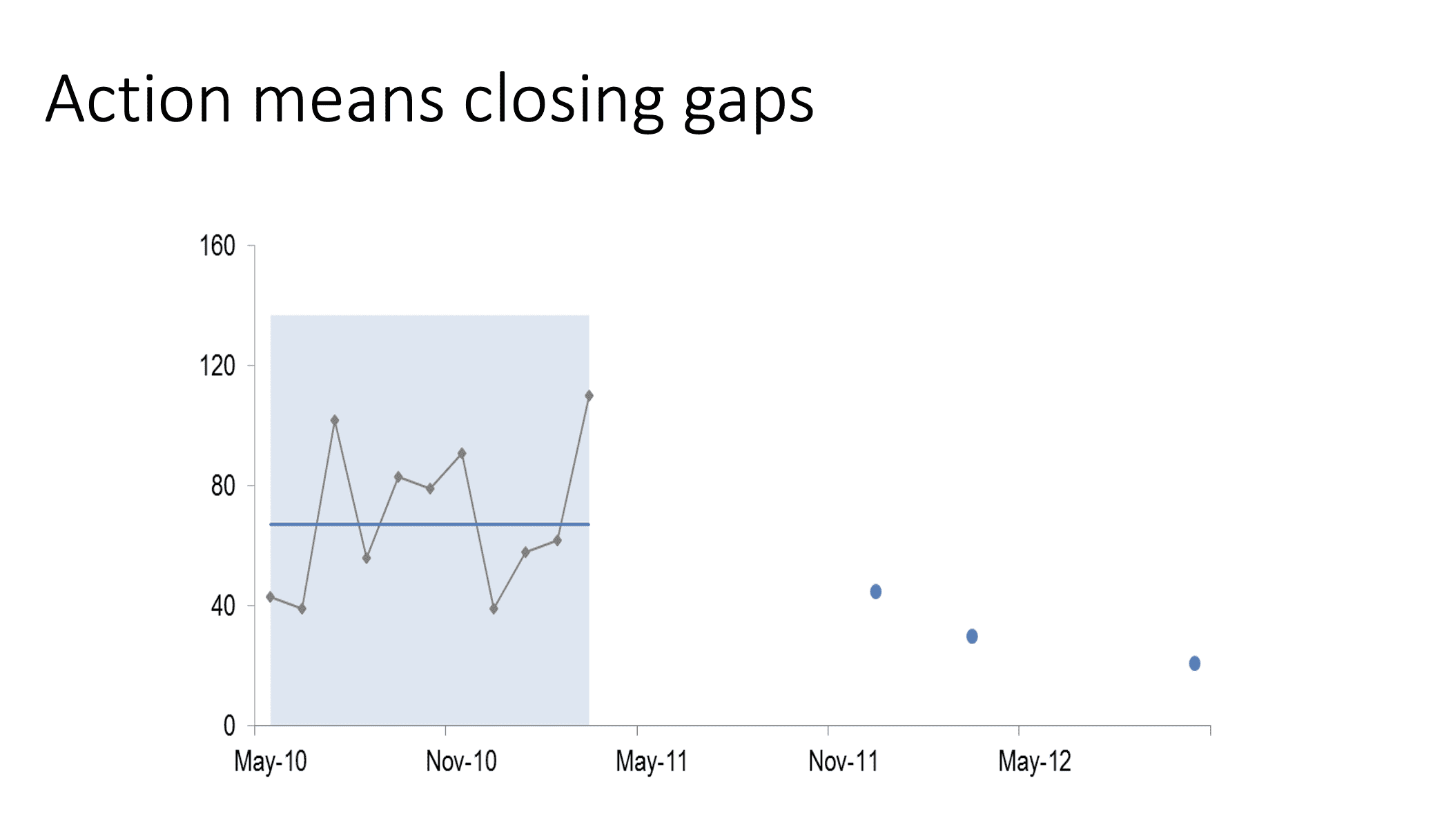
Those of us in charge of strategy execution are usually looking at a goal’s current performance relative to desired future performance. As we implement our projects and actions, we want and need to know if our performance is getting better, worse, or staying the same over time.
Yet common visualizations in our dashboards (what we call “limited comparisons”) make us draw improper conclusions from our data. These limited comparisons are not signals and usually cause us to react when we don’t need to, or not react when we should. They are based on assumptions that are not true and cause us a lot of waste in our decision-making because we are not honouring the natural variation (also called noise) that every performance measure has.
Here are the 4 most common limited comparisons that create noise in strategy execution decision-making:
- Comparing only two points of data (such as this month to last month or to target)
- Noise: It assumes last month was “normal” and worth comparing to, but two points of data are not sufficient to conclude a change has occurred in performance. This limited comparison is why reports that use dials, gauges, pie charts, and bar charts for performance measures create so much noise. We need 5-15 data points (or more) before we can see how much natural variation a performance measure has (depending on the complexity of the business process). Remember, we only want to react when a real change in performance has occurred.
- Using trend lines because Excel provides them
- Noise: Just because software produces a trend line, doesn’t mean there is a trend. Trend lines don’t explain enough about the data set because they only show slow, gradual change. We miss sudden shifts in performance (which are common when you invest resources into change) or the fact that nothing has changed at all.
- Smoothing away the ups and downs in data by using moving range charts
- Noise: This type of chart assumes variation is too “messy” to help with making decisions and produces the same problem as trend lines where they won’t show sudden changes in your data (once again missing abrupt changes in performance)
- Current year trend lines
- Noise: Data does not pay attention to calendars. Many people ditch the prior year’s data and start reporting only on the current year. By ignoring past performance, we are assuming that a few points of current data are all we need and that historical data from last year has no value in our decision-making.
Many of us responsible for producing dashboards and reports are conditioned to use these types of data visualizations that create noise. As a result, leaders have incorrect data analysis and insights, causing costly, incorrect assumptions about the impact of their actions.
Leaders need to improve their ability to see true signals of change
How can we filter out the noise and practice “decision-hygiene”?
“While every data set contains noise, some data sets may contain signals. Therefore, before you can detect signals within any given data set, you must first filter out the noise”
Donald Wheeler, Understanding Variation, the Key to Managing Chaos
Leaders, without even knowing it, are making expensive strategy execution decisions, based on noise because they have misinformed beliefs and bad habits when it comes to designing measures and interpreting performance data.
Use XmR charts for all your performance measurement data visualizations
As we now know, most performance reports and dashboards are filled with visualizations that mislead, overwhelm, and distract decision-makers (ie. lots of noise). XmR charts instead produce statistically sound signals that filter out the noise and reveal whether performance (on average) is improving or not. In other words, these powerful visualizations let leaders know whether the actions they are investing in are having the desired impact and moving towards target.
XmR charts, invented by Shewhart, have been around for decades and, once leaders are familiar with the basics, are very easy to use. More importantly, they encourage statistical thinking and reduce bias in human decision-making.
“Millions of people have proven, by their own experience, that XmR/control charts work. This approach for understanding and using data is not on trial. The question is not whether the technique will work, but rather whether or not you will choose to make it work.”
Donald Wheeler, Understanding Variation, the Key to Managing Chaos
Are you ready to reduce the noise and improve your performance during strategy execution?
Leaders are likely unaware of all the time, money, and effort they are wasting by listening and responding to noise in their performance measures that should be ignored. The solution is to test your strategy execution decisions by using the data visualization technique (XmR chart) that reveals trustworthy signals in the noise and proves whether your efforts are having any impact at all.
For more information on reducing the noise in your performance measurement by using Xmr Charts, read more here.

Watch for Part 2 of this blog in August: Why Most Actions Don’t Improve Performance.
The PuMP® Performance Measure Blueprint was created by Australia’s performance measure specialist Stacey Barr. Louise Watson of Adura Strategy is North America’s Official Partner and Licensed PuMP® Blueprint consultant.


